Media Kit
Our brand is more than a logo or a set of colours. Our brand is our story. It’s the feeling people get when they think about Casiqo: curious, confident, and ready to play. Everything we do flows from this feeling.
We used to be an operator, so we know the industry inside out. Now, as an affiliate, we’re here to cut through the noise and ask all the right questions.
We’re serious about iGaming, but we never forget that it’s built on play. Standing out means embracing the chaos, the colour, and the creativity that make this industry what it is.
At Casiqo, we take our work seriously, but not ourselves.


Our Logo
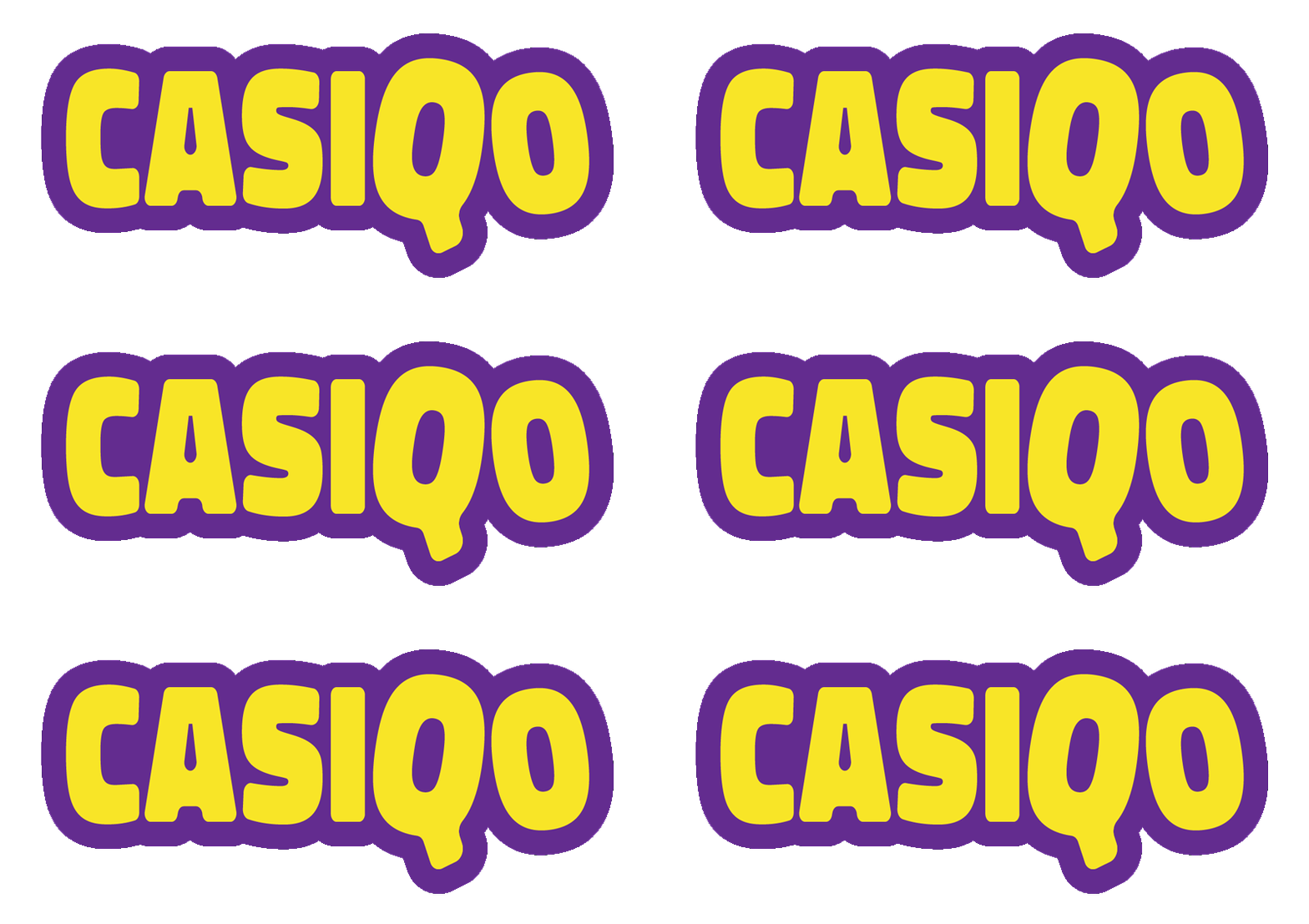
Rounded edges, jaunty angles, and bold colour. Our logo captures exactly what Casiqo stands for: playful, confident, and impossible to ignore. Consistent use ensures the brand is instantly recognisable.
Animated Logo
At Casiqo, we are always asking questions. The “Q” stands for question, and this is reflected in our animated logo, where the Q alternates with a question mark. The animated logo should be used wherever possible digitally, but only ever one animation per page.

One Colour Logo
The one colour logo outline should be used only when absolutely necessary (for example print restrictions) and only ever in the below colour combinations.
Logo Placement
To ensure our brand always looks professional and our logo remains consistent in all situations, please follow these logo lockup guides:
White Space
Our logo needs room to breathe. Always keep clear space around it that’s equal to the width of the Casiqo “I.” At the top, give it a little extra lift by using one and a half times that width. This ensures the logo stays visible, balanced, and consistently presented across every use.
Central Anchor Point
Because of the tail on the Q, the logo looks slightly off-centre when aligned to the centre of an object. To fix this, use the white space guide to define the outer boundary box, and centre the box, not the logo itself. This keeps the logo optically balanced, even if it isn’t mathematically centred.
The Casiqo “Q”
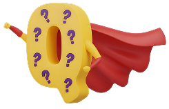
In spaces where the full logo would feel cramped (or where the audience already knows they’re in Casiqo territory), the Q can be used as a standalone logomark.
The Casiqo Q
The Q holds enough personality and recognition on its own to represent the brand in tight layouts, favicons, social avatars, small UI elements, and other reduced formats. It works because the shape is distinctive, bold, and instantly tied to our identity.
The Casiqo “?”
The question mark icon was custom-designed to match the Q’s curve, proportions, and overall shape. We use it alongside the Q in illustrations to reinforce our core message: Q stands for questions. It brings curiosity to life visually and builds a consistent storytelling layer across our brand world.
Casiqo Colours
Jackpot Purple
Main logo colour. Best for title text on yellow and 50:50 with yellow in illustrations.
Lucky Marigold
Main logo colour. Avoid white backgrounds to maintain contrast and legibility.
Deep Amethyst
Ideal for backgrounds, large spaces and body text on a white background
Casiqo Typography
We chose Rubik for its slightly rounded corners and clean, geometric shapes. The font is friendly and welcoming while remaining highly legible, carrying the same playful energy and curiosity that define our brand. Rubik works seamlessly across digital and print, keeping our messaging consistent, readable, and unmistakably Casiqo.
Aa Bb Cc Dd Ee Ff Gg Hh Ii Jj Kk Ll Mm Nn Oo Pp Qq Rr Ss Tt Uu Vv Ww Xx Yy Zz
1234567890 !@#$%^&*()
Aa Bb Cc Dd Ee Ff Gg Hh Ii Jj Kk Ll Mm Nn Oo Pp Qq Rr Ss Tt Uu Vv Ww Xx Yy Zz
1234567890 !@#$%^&*()
Our Values
Trust
We work with honesty and integrity, partnering only with brands our audience can rely on.
Curiosity
We ask bold questions, explore every angle, and give people the tools to think and decide for themselves.
Fun
We inject excitement, colour, and energy into everything we do, creating bold, memorable experiences that spark engagement.
Our Tone of Voice
This is Casiqo’s brand voice, which should be used whenever we are speaking directly on social media, the website homepage, or any channels where Casiqo communicates as a brand. Casino reviews are written by our experts and follows a separate set of tone of voice guidelines, which can be found here.
Brand Name
Always write the brand as Casiqo.
For initiatives which play on the “Q” like CasiQuestions , capitalise the Q.
Key Principles
Keep sentences simple, clear, and readable.
Ask questions and invite exploration.
Be professional but playful.
Stay consistent with Casiqo’s trustworthy, curious, and fun personality.
Contact Us
For any questions about using our brand assets or to request additional resources, please reach out to our team at info@casiqo.com or click the button below. We’re here to ensure consistent, accurate, and confident use of our brand across all applications.